In our blog entry on style versus fashion, we identified the difference between these two concepts and touted the benefits of dressing stylishly as opposed to fashionably.
So, how do we dress with style? Our image consultants and suit specialists in Philadelphia created the concept of the Three Pillars of Style to provide a roadmap any man follow to ensure that he’s dressed in a permanently stylish way that’s still unique to him.
The three pillars are as follows, all of which are clickable links:
- Fit
- Color Coordination
- Pattern Coordination
Similarly to the combination of melody, harmony, and rhythm in a timeless piece of music, the idea here is that good, permanent style is achieved when your wardrobe rests on these three pillars simultaneously.
Read on for explanations of each pillar below.
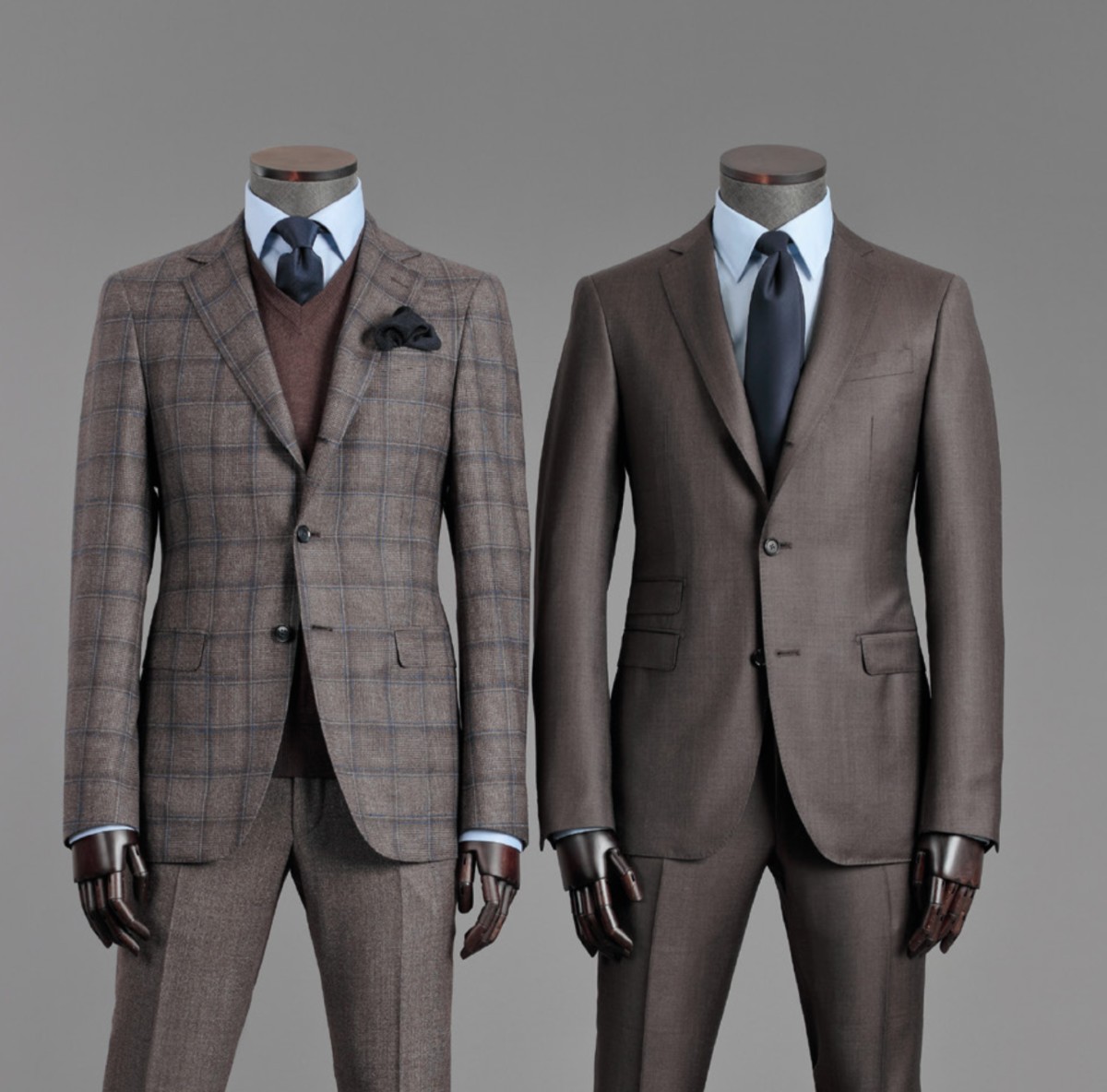
Pillar One: Fit
If you take only one thing away from this blog post, let it be this:
Fit is the most crucial element of dressing in a permanently stylish way. All other things being equal, a man wearing jeans and a t-shirt that flatters his frame will look better than a man in a $5,000 suit that pulls at the front buttons or has saggy pants.
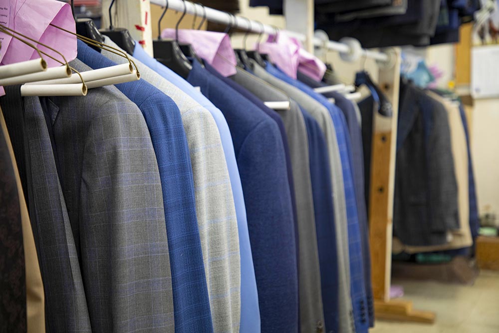
We would be remiss if we didn’t mention that having your clothes made for you is the most direct method of achieving a great fit. Getting your clothes tailored is the next best way to ensure proper fit of all the garments in your wardrobe.
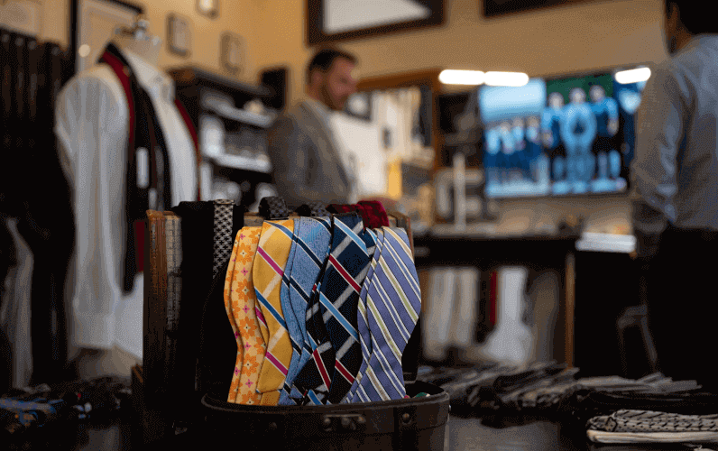
Pillar Two: Color Coordination
The second Pillar of Style is color coordination. No matter the time of year, occasion, or locale, if your colors are judiciously selected and well-coordinated, you will be dressed in a permanently stylish way. On the other hand, the most expensive pieces in your wardrobe won’t look stylish if their colors aren’t well-coordinated.
This is, of course, more easily said than done. Color is a tricky thing; not only do men have a higher prevalence of colorblindness than women, we are also not trained to perceive colors the way that women are.
Case in point, your girlfriend or wife’s mother likely taught her how to select and apply makeup in her early teen years. It’s unlikely that you received similar training at that age, hence the knowledge deficit in this area.
Understanding color coordination, however, will take your style to the next level. Many factors go into color coordination, so we recommend starting with these tips to make coordinating colors in your outfit easier.
- Download a color wheel. Literally Google “color wheel” and do an image search. Print out the simplest one you find and tape it to the door of your closet. This will help you see the inter-relatedness of colors and provide a visual reference for when you’re wondering if colors “go together.”
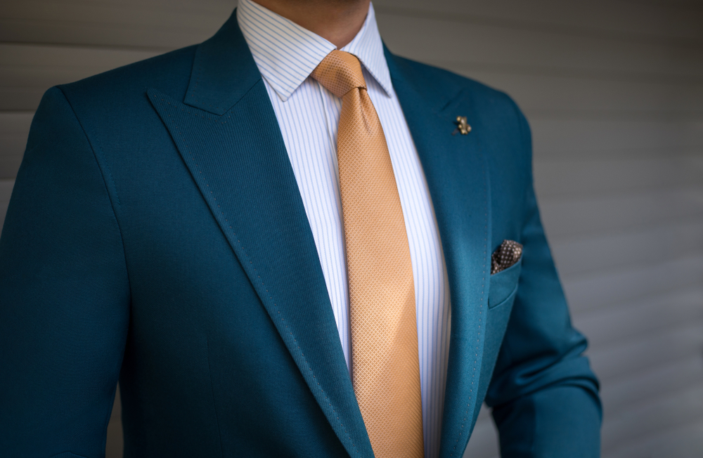
- Embrace the core color concept. This is where we have a dominant color in an outfit that serves as a focal point. This would usually be the color of a jacket or suit, and you can decide the color of your shirt/tie/pocket square using the core color as a jumping off point. A simple example would be a navy blue jacket with a light blue shirt and a white pocket square with blue trim.
- Learn about complementary, analogous, and monochromatic color schemes. Complementary colors are across from each other on the color wheel. Analogous colors are next to each other on the color wheel. Monochromatic color schemes involve the same color, sometimes in different shades. Use these schemes as a jumping off point for color coordination.
- Look to sports teams’ uniforms. The New York Knicks wear blue and orange. The Lakers wear purple and gold. The Sixers wear red and blue. Why not coordinate your shirts, ties, pocket squares, and socks similarly when the occasion is right?
Because we’re all different and have our own color preferences (not to mention certain colors that work best with our skin tone, hair color, and eye color), there are no set rules about what your color palette should be. What we recommend is that you understand how you feel and look when you are wearing certain colors and that you strategically integrate them, rather than buying everything you see. Experiment, experiment, experiment.
Pillar Three: Pattern Coordination
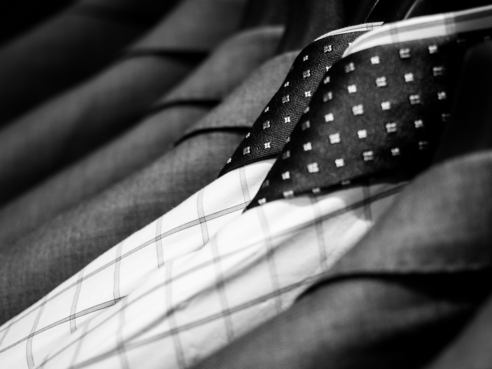
Last but not least, stylish men coordinate patterns well. There are a variety of patterns used in the men’s clothing industry. Houndstooth, checks, stripes, paisleys, and dots are examples of timeless patterns you could include in your wardrobe. Before you hit the streets mixing patterns, we recommend these guidelines:
- Scale is key. If you’re mixing like patterns, the rule of thumb is that their scales should vary. For example, if you’re wearing a large-scale windowpane suit, match this with a smaller-scale gingham shirt or plaid tie.
- When mixing unlike patterns, scales should be similar so as to maintain continuity from one garment to another. A shirt with thick rope stripes will pair well with a large-scale polka dot tie, and a micro-gingham shirt will look great with a large-scale repp stripe tie.
- Don’t mix two small-scale patterns, whether like or unlike. This causes the viewer to squint uncomfortably.
- Consider the direction of patterns, meaning vertical or horizontal. This generally refers to stripes and checks, and their scales should vary.
Tying It All Together
While these three pillars are important to master on their own, outfits become greater than the sum of their parts when they’re utilized simultaneously. When you’re mixing patterns, for example, make sure the colors in each of those patterns are harmonious, and make sure the garments fit you as they should.
It’s likely that this blog post generated just as many questions as it did answers, and we’re happy to chat. If you’re looking for a boost in your image, fill out a contact form to schedule an appointment with one of our specialists!