Summertime is all about color. Looking light and bright not only matches the sunny days of the season but also lets people express themselves in new ways and creative ways. The only issue is many men struggle to combine colors without looking like a rejected Jackson Pollock canvas. Have you ever looked through a magazine or seen a well-dressed guy on the street and thought to yourself, “Man, that dude looks great, but I could never pull that off.” Trust us, you aren’t alone. Thankfully, there are some baby steps that you can take to dip your toe into color mastery. In today’s blog, we will be breaking down the fundamentals of color coordination.
Color Coordination Rules
Thankfully, color coordination is just like any other skill; it can be improved with practice and knowledge of some basics. To that end, here are some tips:

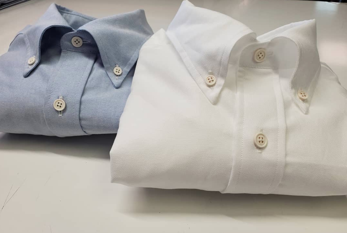
- A white shirt serves as a blank canvas for suits and ties. Use this to your advantage when starting out. Any color will stand out and be complimented when paired with a white shirt.
- Red, blue, and yellow are primary colors and generally work well together. Try a blue shirt with a red or a yellow tie to see how that works. A good example of primary colors working in tandem is the team colors of the Philadelphia Phillies. The red and blue sure does look classy and there is a reason for that. When you are starting out try sticking to only two opposing primary colors. While you will usually be safe mixing all three there is no need to run before you have mastered walking.
- Orange (red+yellow), purple (red+blue), and green (yellow+blue) are secondary colors and generally work well with each other and with their primary counterparts. While they’re hated around these parts, the Knicks’ colors are blue and orange, and the Lakers’ colors are purple and yellow are prime examples. Blue shirts go well with orange ties, and if you ever find a yellow tie with purple pin dots, purchase it immediately. Then pair it with a lavender paisley pocket square and listen to the compliments roll in.
Dress For The Colors That Are Naturally Present
We all have color tones naturally present in our features, whether that be our skin tone, eye color, or hair. An easy way to make your outfit pop is by steering into our naturally present colors.
- Got blue eyes? A blue tie will make them brighter. Do you have sandy blond hair? A tie with an earth tone like rust will bookend your face wonderfully.
- Regardless of the color of your skin, there are undertones in your face. These are colors you can see just underneath the skin; people with “rosy cheeks” have pink undertones, some are more yellow, peachish, etc. Mimicking these tones in the garments that surround your face (i.e. shirt and tie) will enliven your countenance and make you look better.
- The intensity of your color variation is called contrast, we tackle this concept in a much more detailed sense in our blog “what is contrast in menswear?” But in a general sense if you have a high contrast complexion, I.E. dark skin, light eyes, sandy hair then a high contrast look will compliment you well. Low contrast looks, I.E. pale skin, light eyes, blonde hair then reach for more low contrast clothing.

Keep Your Distance
In the beginning it is tempting to combine all the colorful pieces you own, but before we risk looking like a rejected Tommy Bahama design it is important to anchor your outfit. By that we mean keeping the major pieces of your ensemble I.E. your jacket and pants muted so that you can employ color tastefully in your shirt, socks, ties, and pocket square. Separating bold colors and patterns gives them a stage to shine. The distance between each element preserves a formal look while also creating the sense that each piece is a part of a whole.

Conclusion
This is just the beginning when it comes to color. If you have any questions or are looking to add some pop to your wardrobe give us a call 215-310-0219 or email info@henrydavidsen.com.