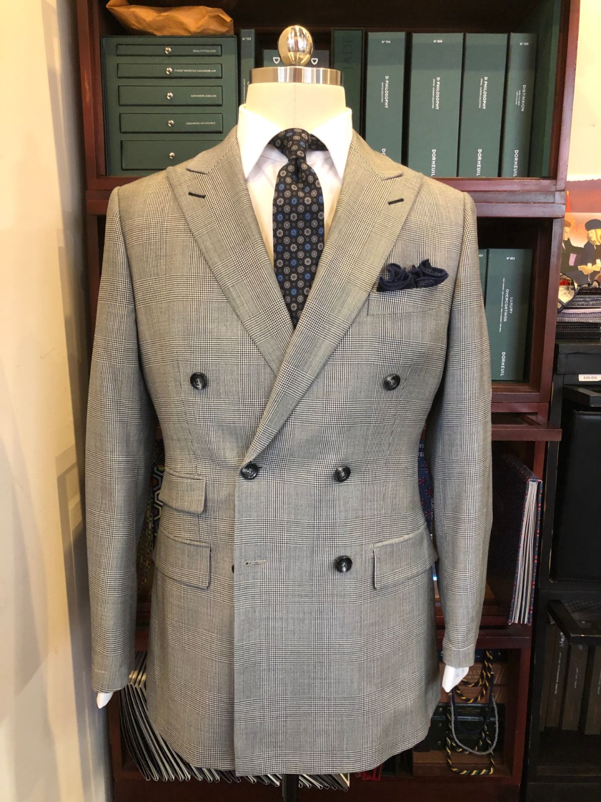
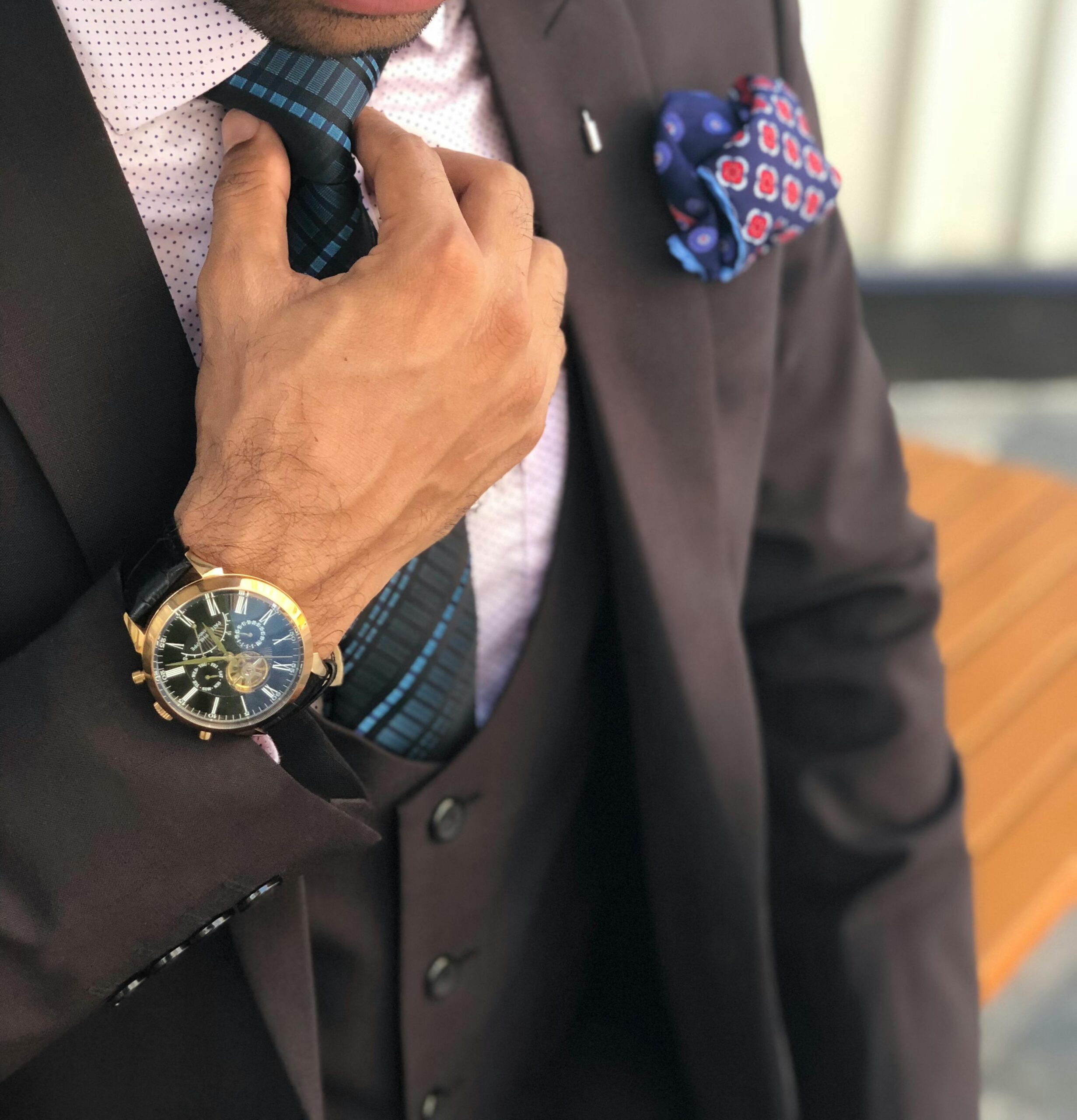
For years, lots of menswear blogs – this one included – have put virtual pen to paper about color in menswear. This is by design, because even after years of releasing color-driven content, men everywhere are still Googling “what color shirt goes with what color suit” or “how to make your outfit pop.” Philadelphia and New York are no different.
We want to help you learn how to make your outfit pop if you so choose. To that end, we wanted to provide more background on rudimentary color theory, which we’ll do in the first section of this article. The second and third sections will offer concrete examples of items you can use to flex color into your outfits successfully.
To truly understand how color works in what we wear, we need to take a look at a color wheel and revisit concepts from elementary school art class: primary and secondary colors. We will also discuss neutrals and their importance.
Without further ado, here’s our Men’s Guide To Color & Making Your Outfit Pop.
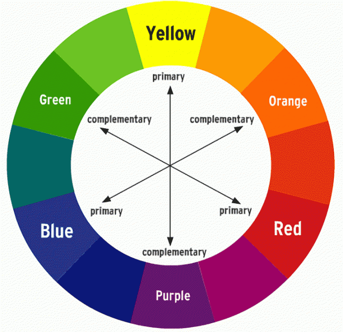
The Color Wheel
Do yourself a favor: print this below color wheel out and hang it inside your closet door. It is the ultimate cheat sheet when you’re wondering if that tie goes with that shirt.
Primary Colors
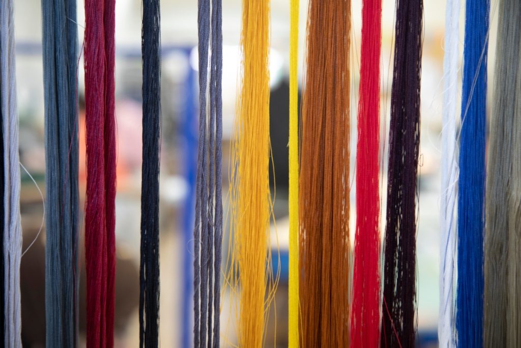
There are three colors from which all the other colors in the spectrum are derived: red, blue, and yellow. They are referred to as primary colors because they are considered the “starting point” for other colors. They tend to look very good together – a navy suit with blue shirt, yellow tie, and red/blue pocket square would be a great look.
Secondary Colors
When you mix two primary colors, the result is a secondary color.. The results can be purple, green, or orange. An easy way to think about it is to liken the combinations to simple addition problems:
- Red + Blue = Purple
- Red + Yellow = Orange
- Yellow + Blue = Green
While you have to be cognizant of what specific shades of the colors you’re using (something for a different post), secondary colors play nicely amongst themselves and with primary colors.
A perfect example of this is the uniform for the Los Angeles Lakers: gold (a variant of yellow) and purple. While you might not want to wear a gold shirt with a purple tie, a light blue shirt with a purple/gold striped tie can be a very handsome look.
Neutrals
 Neutrals are colors that go well with just about any color paired with them. These are grey, black, navy, brown, white, and off-white, also known as khaki, ecru, eggshell, and some other names.
All well-functioning wardrobes have a healthy dose of neutrals. For most of us, these colors form the bedrock of our day-to-day outfits and allow us to play with the primary and secondary colors we’re discussing here. Most pants and jackets – and many shirts – are made in these colors.
Five Easy Ways To Give Outfits A Pop Of Color
Below are five pieces that provide ample opportunity to flex your color muscles. Strategic use of these accessories will give your outfit the added pop that elevates your overall look.
Ties
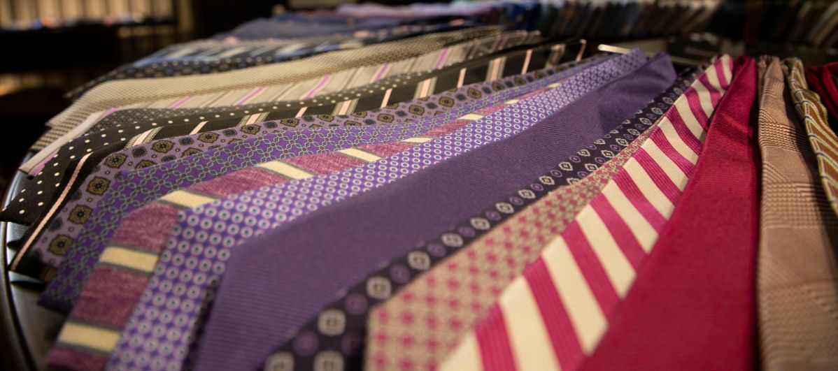
Despite Goldman Sachs’ now-famous move to relax their dress code, a tie remains an important business garment, not to mention an accessory beloved by dandies. The tie’s beauty is in its lack of utility. It’s a purely decorative piece, so it’s natural that it’d be a great place to splash color into an outfit.
Pocket Squares & Circles
Though not exclusively non-utilitarian accessories, pocket squares serve little more than to please the eye. Either paired with a tie or flying solo, they’re available in every color you can imagine.
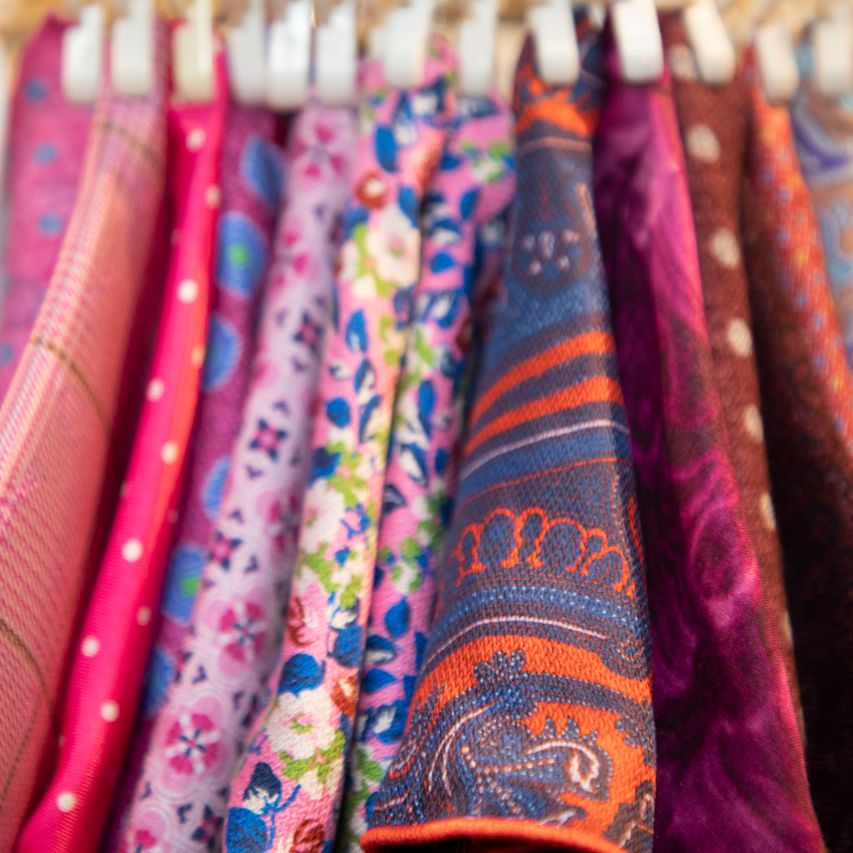 They’re not just made in squares, either. Pocket circles are a fun variant that just as easily gives your look a shot of color, and we’ve got plenty of them at the shop.
Cufflinks
Plenty of cufflinks are made in what we can call “metallic neutrals,” which is sterling silver, gold, or some other precious metal. Others made with neutral metallic backings have brightly colored faces that are displayed when worn. Silk knots, a more casual take on the dressy accessory, are available in a rainbow of colors.
No matter which style you choose to wear, cufflinks can function as a tasteful way to play with color. Coordinate it with your other accessories for a cohesive look.
Watches
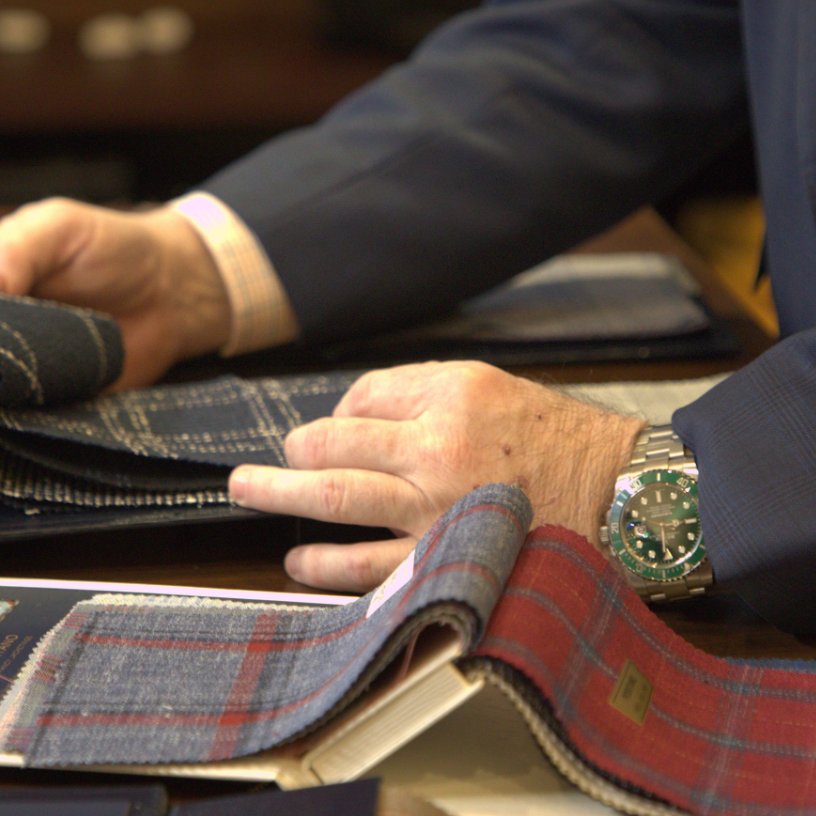 The face of a dress(y) watch like a Rolex Submariner is a fun way to add bold, bright color in a small dose. We think that these types of watch faces look best with metal bracelets.
While we’re on the topic, watch straps are another avenue for color in an outfit, it just needs to be a casual outfit. Available in rubber and nylon, many watches nowadays boast strap interchangeability as a value-add, so treat these as accessories for your more dressed-down days. If using the watch strap to dress up, choose leather in the same color as your other leather accessories (shoes, belt, and briefcase) to create a cohesive and credible look.
Socks
Trendy as the look has been, the bold sock remains a viable tool in your sartorial toolbox. When coordinated with another element in your outfit, a fun sock is a way to give a casual outfit a color boost.
Where To Find Color Inspiration For Men
You can mix and match all the colorful accessories you want, but it’s in your best interest to understand how to maximize the effect of colors. Where can you go for inspiration for how to make your outfit pop? Below is a quick list of places you’ll see pleasing color combinations:
Menswear publications/blogs
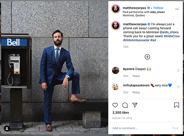 We don’t recommend going into full copycat mode, especially as so many of these entities deal in fashion as opposed to style. Still, if you isolate colors you see and ignore overly trendy looks, you can get some good ideas. If you are going to steal a look from a magazine, steal it from The Rake.
Sports teams
We mentioned it above, and we’ll say it here again: there is color inspiration everywhere in sports. Some color combinations should never be mimicked (no offense, Penguins and Steelers fans, but black and yellow make people think of bees and causes them to pull away from you subconciously), but start paying attention to different uniforms and how you might be able to apply those combinations to items you have in your closet.
Nature
 Open your eyes and you’ll see color everywhere around you. Earth tones look good together because they occur naturally. Blue and tan are present when watching the sunset on the beach with your bare feet in the sand. Pay attention to colors when you’re out for a run (hopefully you’re still getting out during this pandemic).
Art
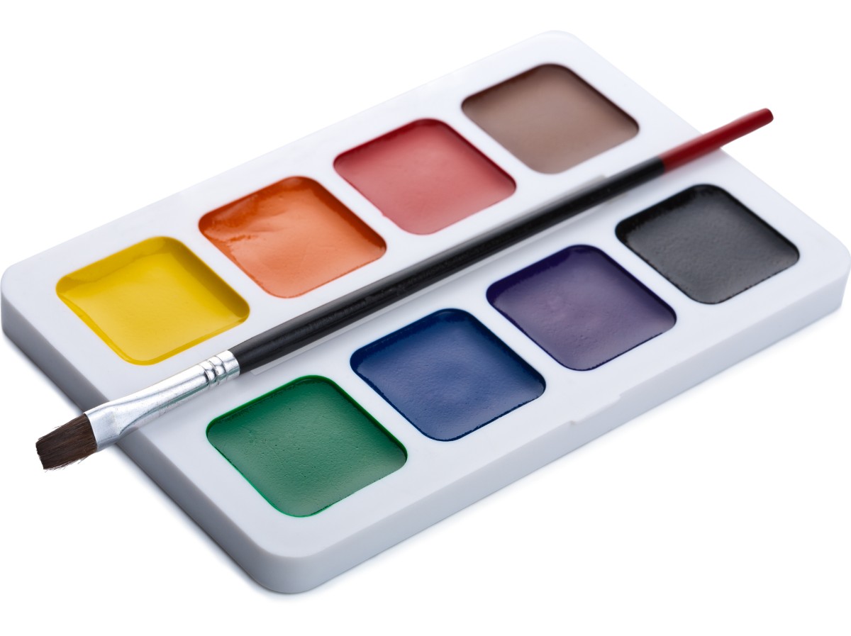 The natural world is a great source for color inspiration, but so is the world that humans have created. Look at and think about artwork that you like, paying particular attention to color.
In all of these cases, try to verbalize why you like certain colors and certain combinations. This will further enable you to master what you like and what works for you.
Conclusion
We hope the information provided here has been helpful. Give us a call at 215-253-5905 or contact us here to start the conversation.
